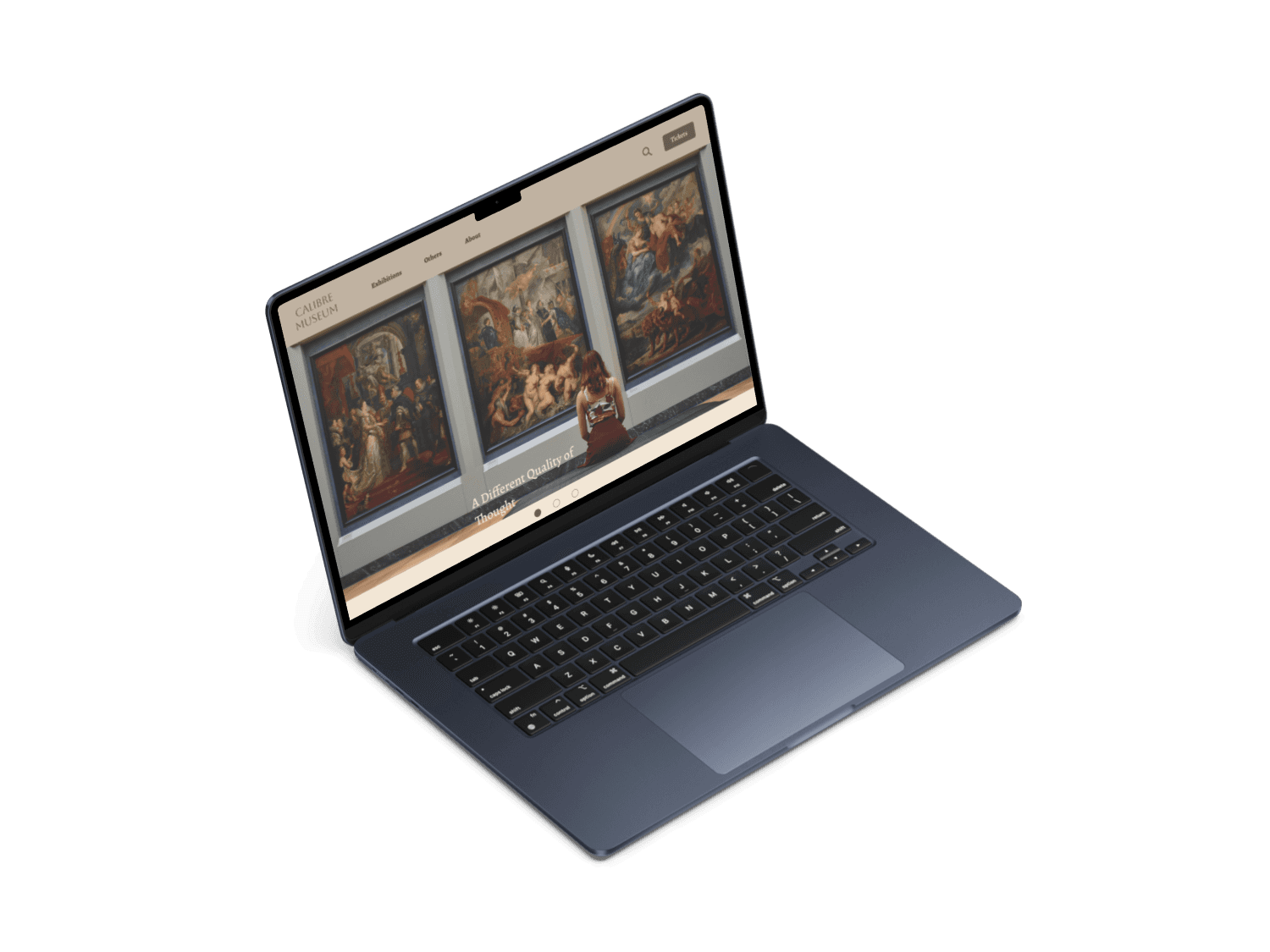
Calibre Museum
A website design for a public art museum that showcases a variety of exhibitions, experiences and schedule visits.
Role
Individual project - plan and execute the whole design thinking process from start to finish.
Responsibilities
Conduct user research
Define problem & provide insights
Persona, user journey, user flow
Visual design of lo-fi & hi-fi wireframes, prototypes and user testing
Timeline
May 2025
Challenge
Overcrowding can happen quite often with museum goers being unsure if their ideal time of visit is packed or not. This is especially inconvenient for people with accessibility needs.
Goal
The ability to access average crowd situation at time of visit.
User Research
I conducted user interviews and secondary research to understand the pain points and user needs. I also studied competitor apps and industry trends to gather insights.
Inability to access current crowd situation of museum to avoid overcrowding.
Limited accessibility for people with disabilities or mobility issues.
Lengthy descriptions for each exhibition which can be overwhelming.
Problem Statement
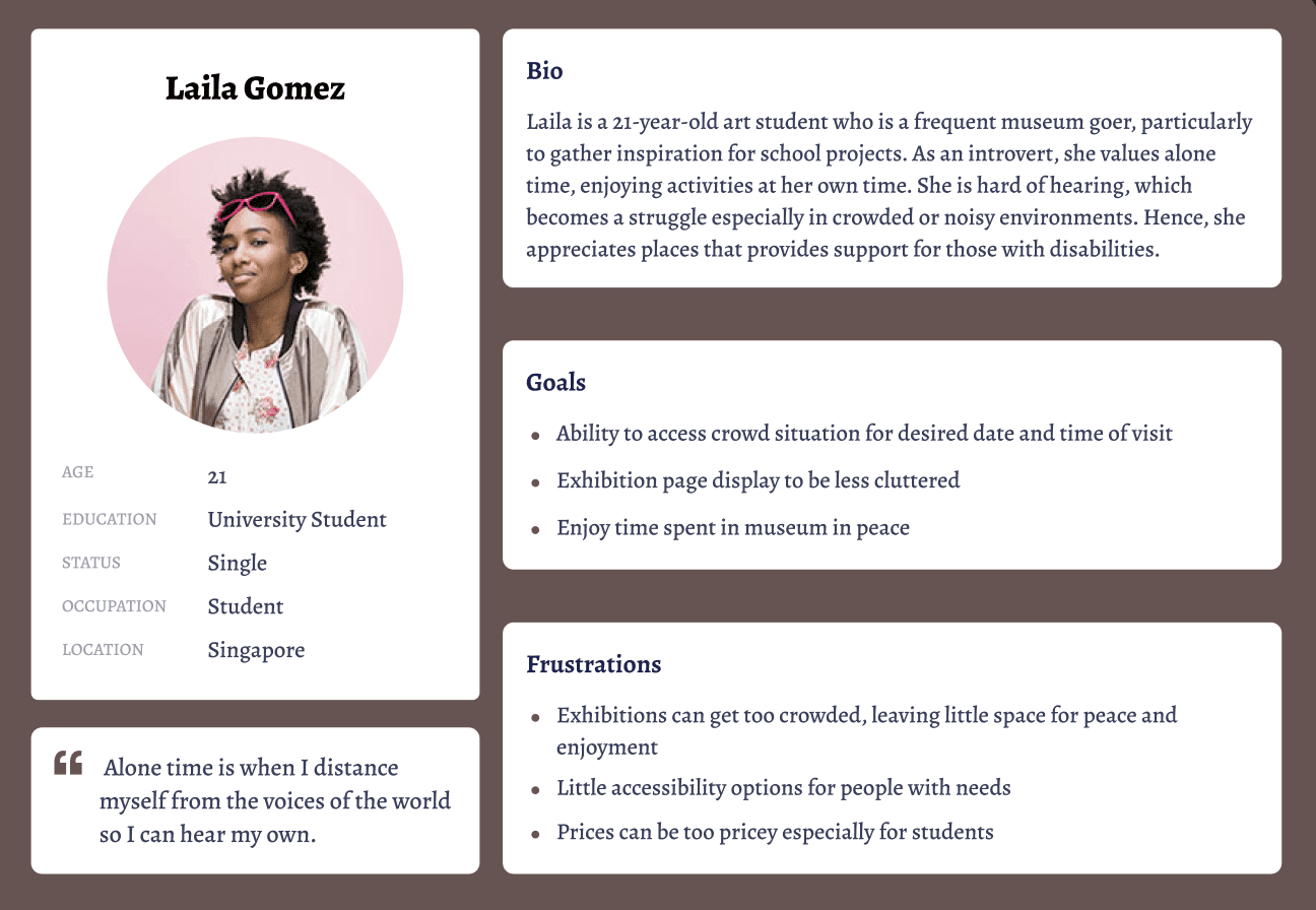
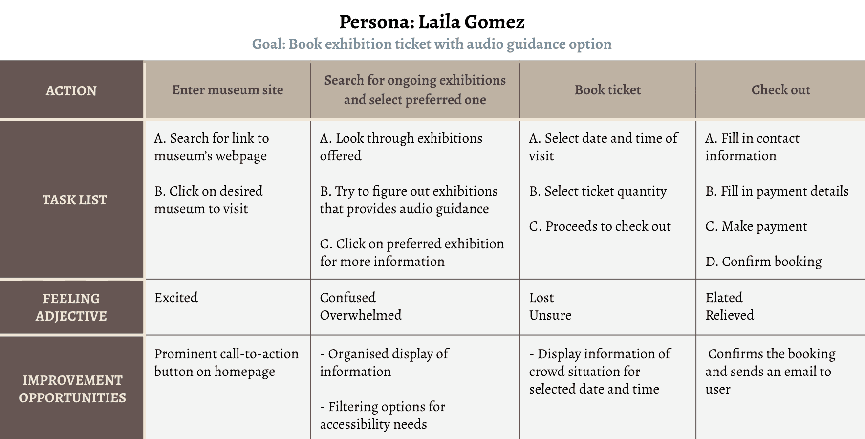
Laila is a busy university student who needs to access museum crowd situations before her visit so she can better appreciate and admire exhibitions without them being too packed.
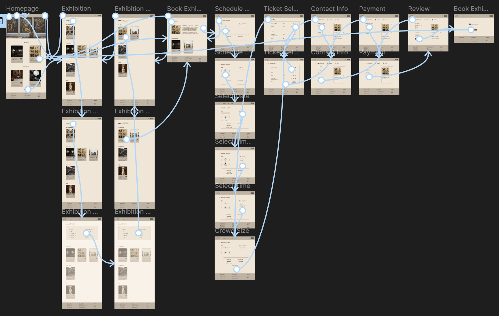
Site Map
I made strategic information architecture decisions that would improve overall website navigation.
The structure I chose was designed to make things simple and easy.

Wireframes
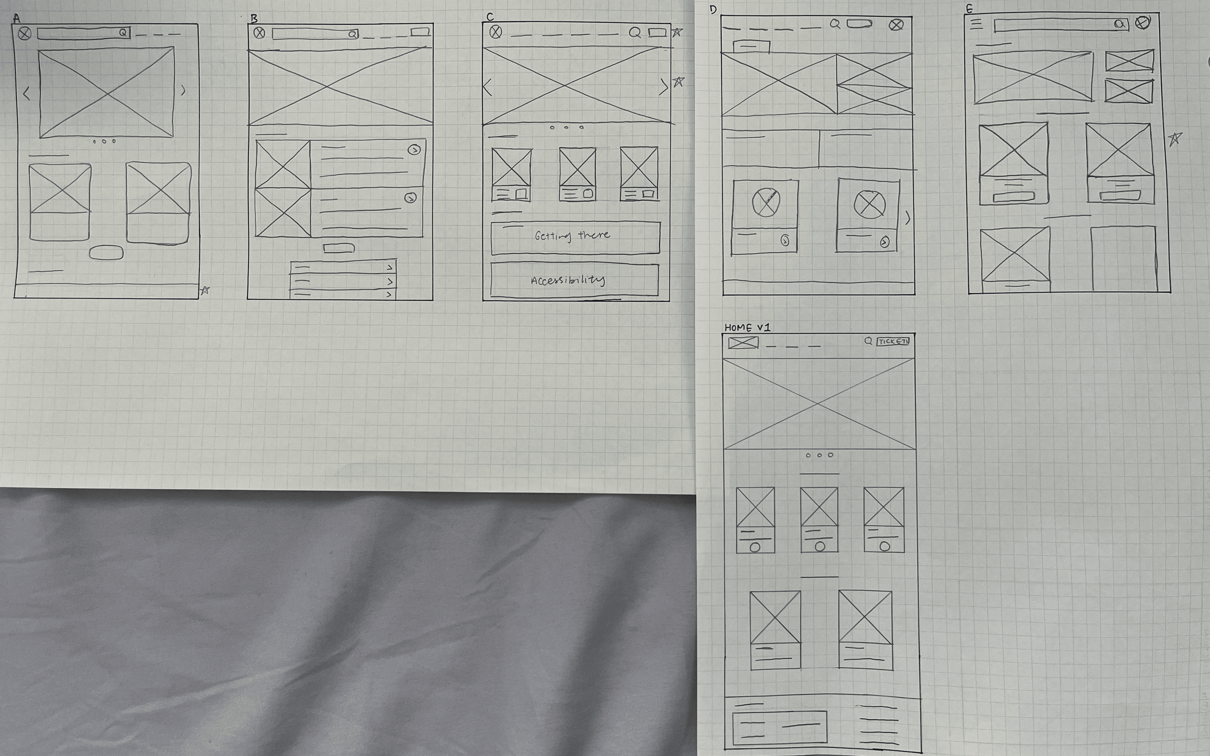
Paper
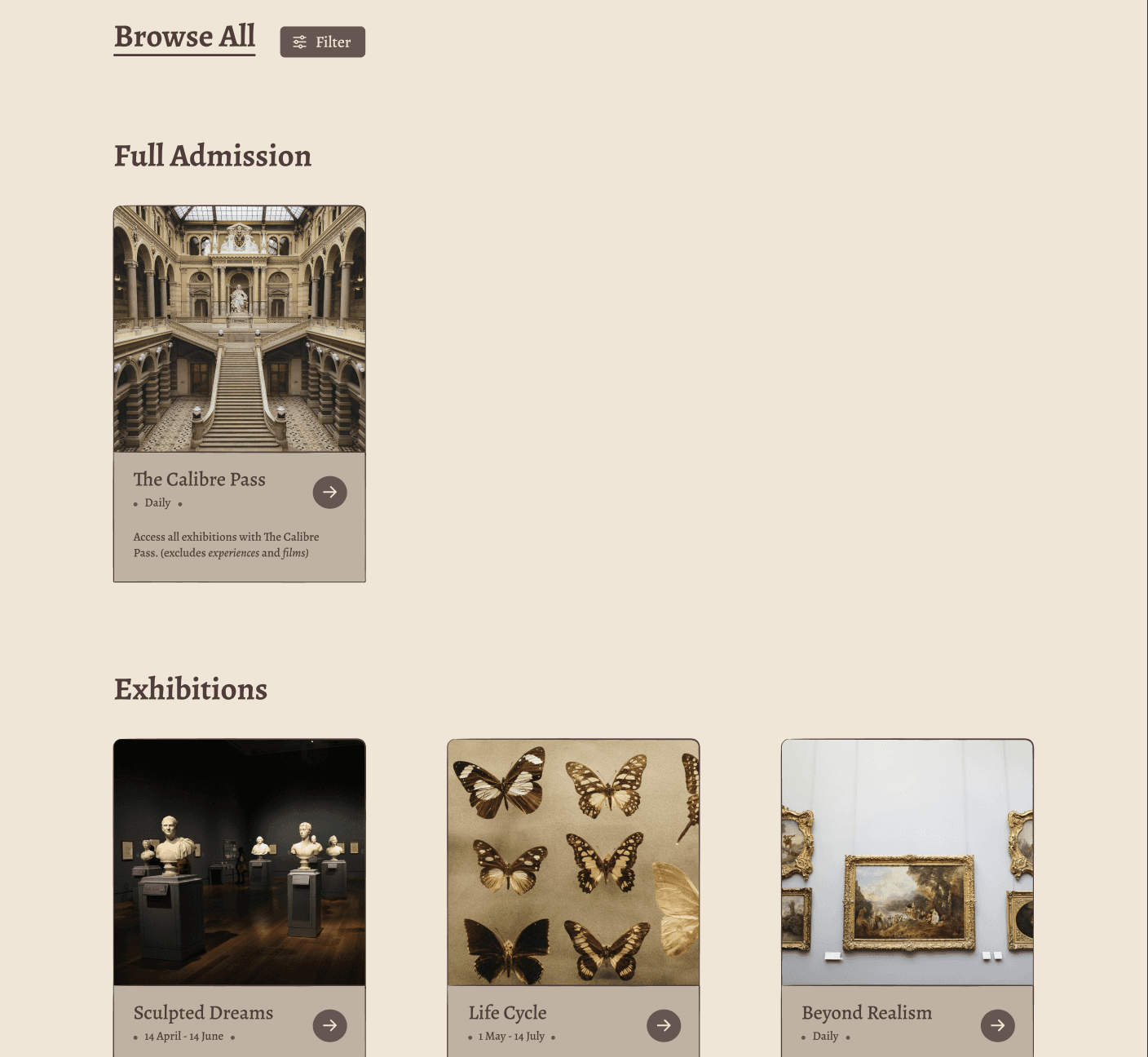
I sketched out numerous homepage wireframes for brainstorming, selected the parts I want included and combined them in the final homepage layout.
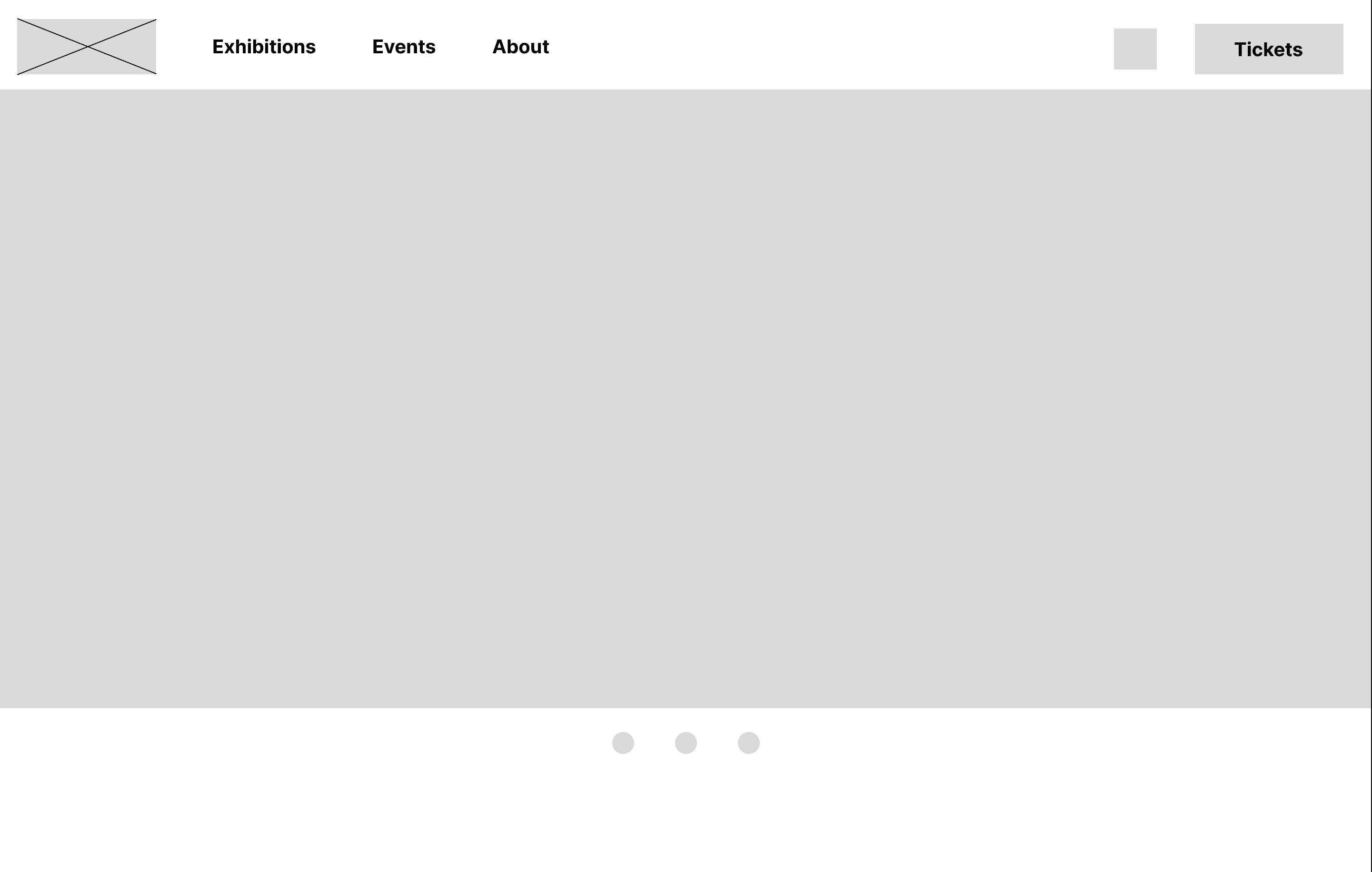
Digital
From paper to digital, I finalised one that best represents user flow and meet user needs. Call-to-action buttons are prioritised, followed by visual element placements.
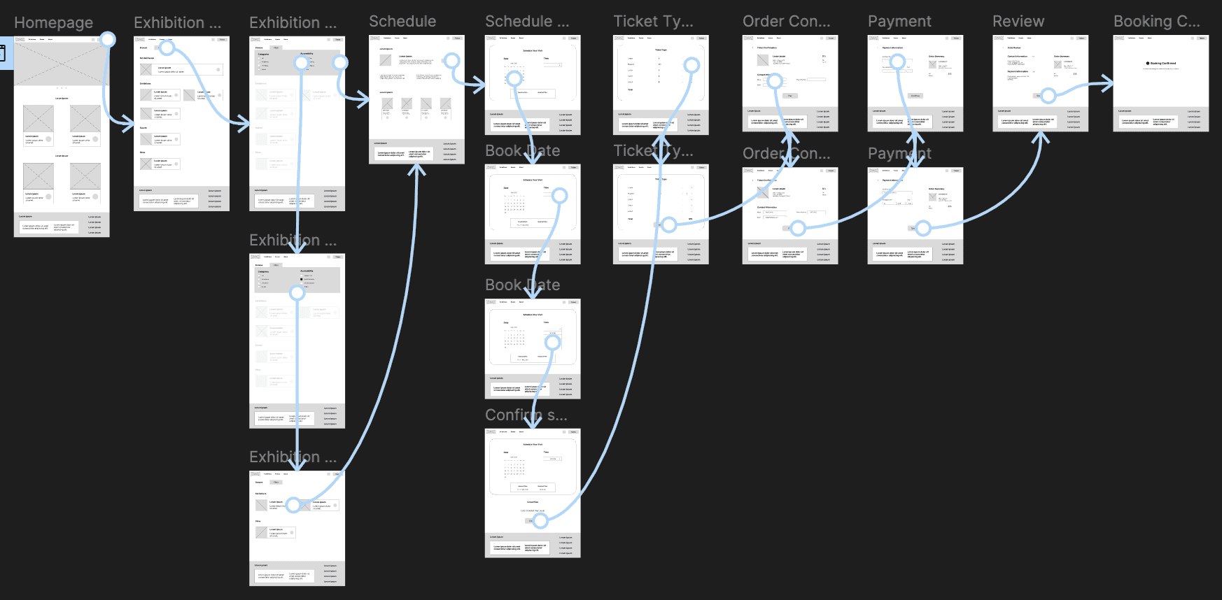
Low-Fidelity Prototype
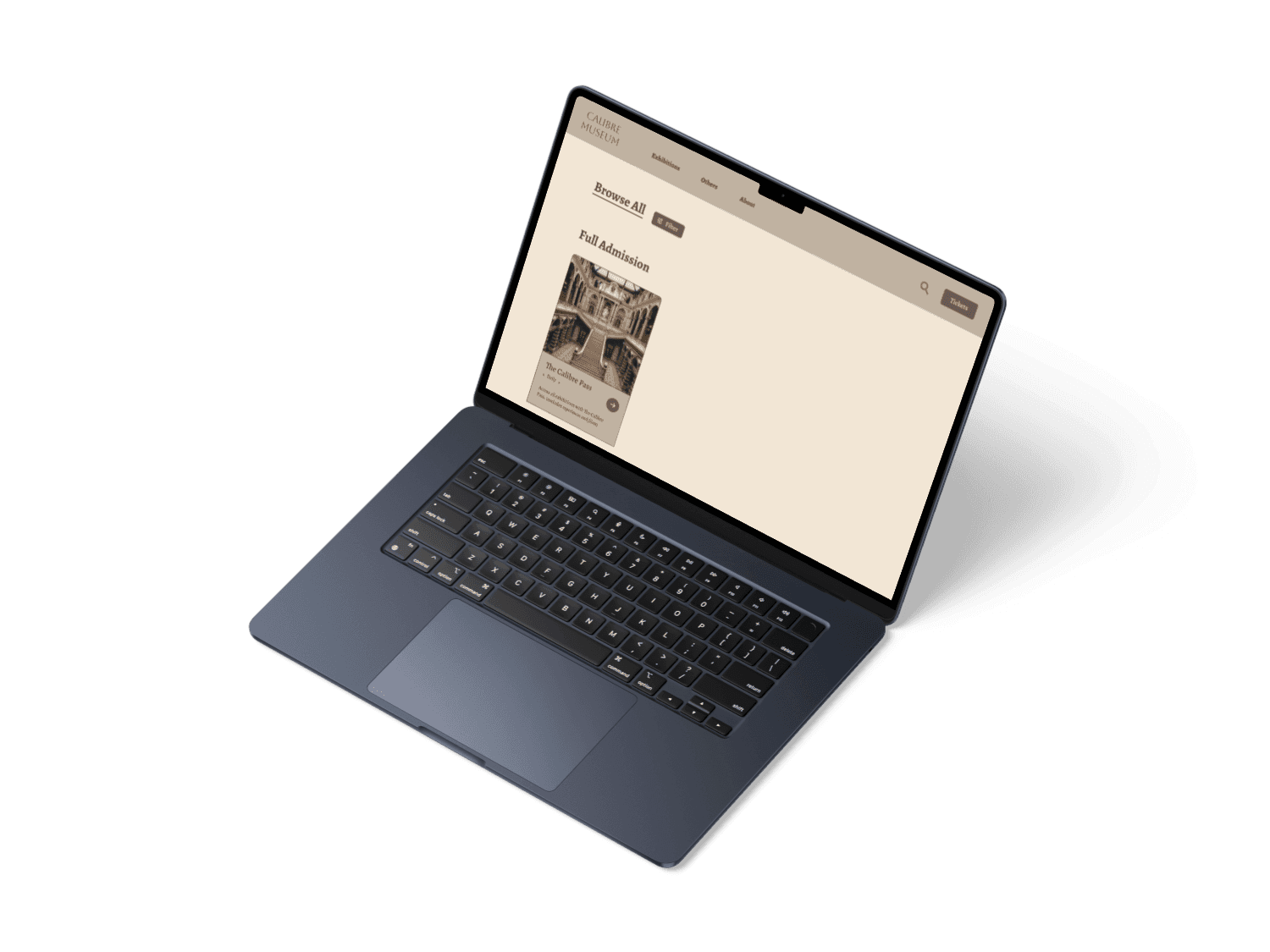
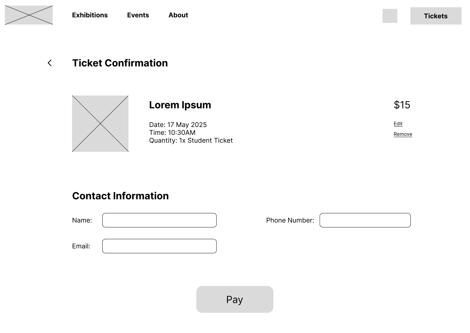
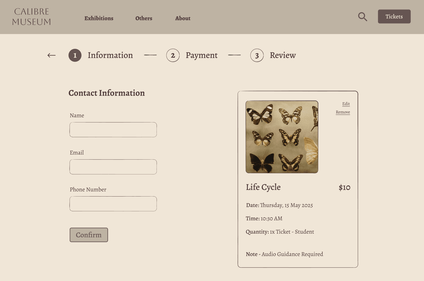
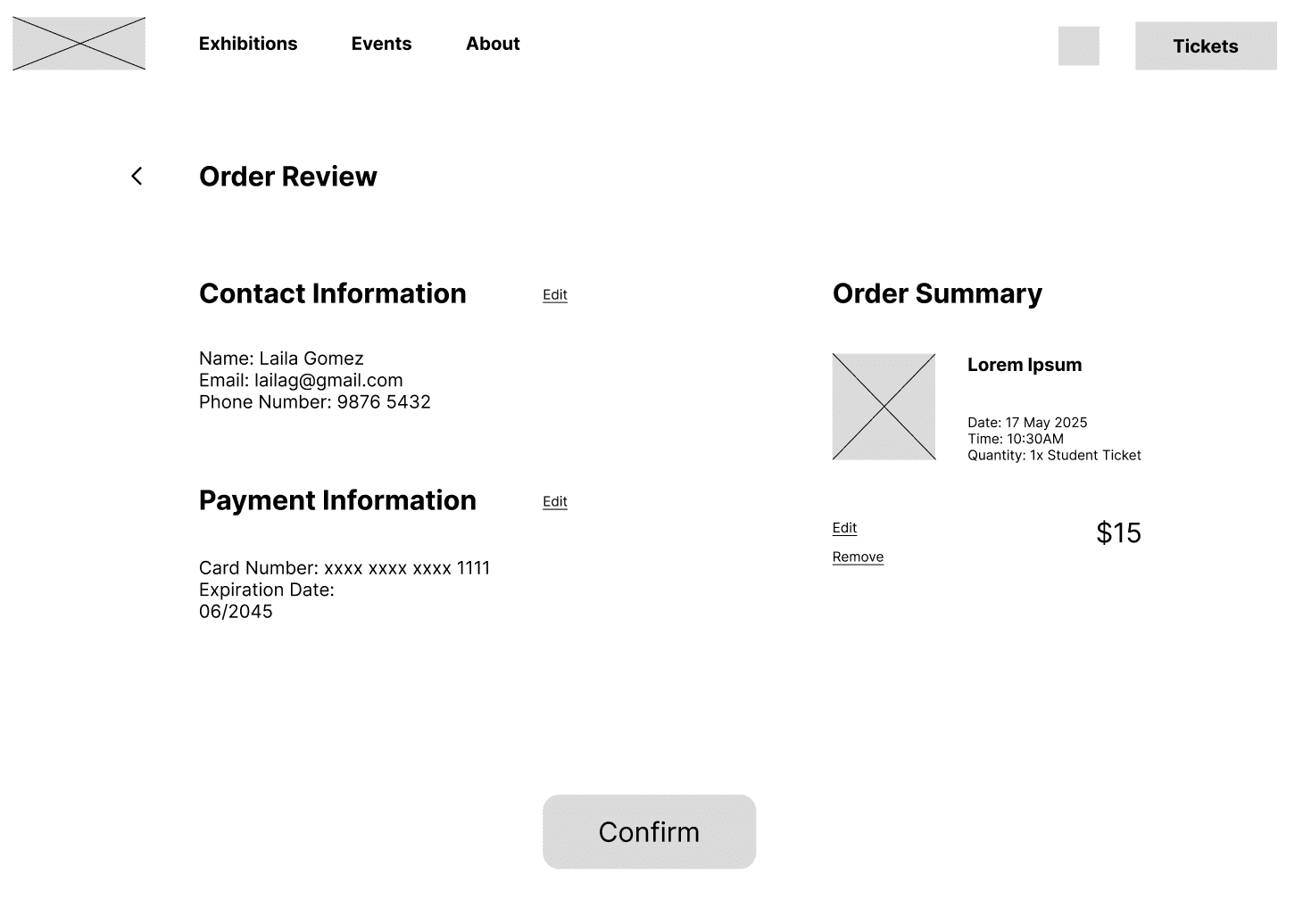
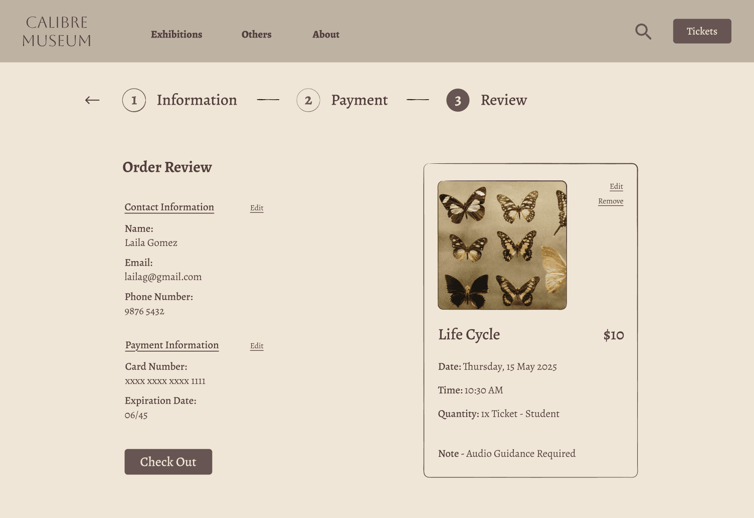
My primary user flow is to book an exhibition ticket by: scheduling date and time > selecting ticket type > confirming and reviewing of order and payment details.
Usability Study
Unmoderated Usability Study
5
Singapore
20-25 minutes
Layout for each page can be inconsistent, leading to jarring view at times.
Information can be too cluttered at times.
Mockups
Layout Consistency:
Based on usability study's insights, I adjusted the layouts of the pages below to ensure consistency throughout all of them.
Before
After
Before
After
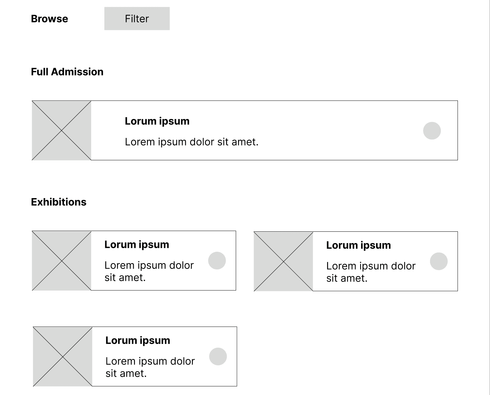
Organised Display of Information:
Based on usability study's insights, I implemented containers to group certain information and aligned texts to make it look less cluttered.
I also included numbered headers so users know the steps needed to complete the flow.
Before
After
Hi-Fidelity Prototype
Following the same flow as my lo-fi prototype, I made design changes based on usability study feedbacks.
UX Prototype Demonstration
Accessibility Considerations
Project Takeaway
Target user finds that navigation and flow are straightforward and easy to access, with a clean layout.
The layout of different elements and information can vastly affect the overall look and feel of the website.