GroPro
A mobile app that helps users locate grocery products in-store.
Role
Individual project - plan and execute the whole design thinking process from start to finish.
Responsibilities
Conduct user research
Define problem & provide insights
Persona, user journey, user flow
Visual design of lo-fi & hi-fi wireframes, prototypes and user testing
Timeline
April 2025
Challenge
Due to constant shifts in arrangements of grocery products, it can be a challenge to locate certain products , especially during peak hours.
Goal
Locate in-store products with ease and in the most convenient route possible, reducing detours.
User Research
I conducted user interviews and survey to understand the pain points and user needs. I also studied competitor apps and industry trends to gather insights.
There is a lack of signage or indication to direct customers to products or sections.
Grocery store can get too crowded especially during peak hours, resulting in longer search time for products.
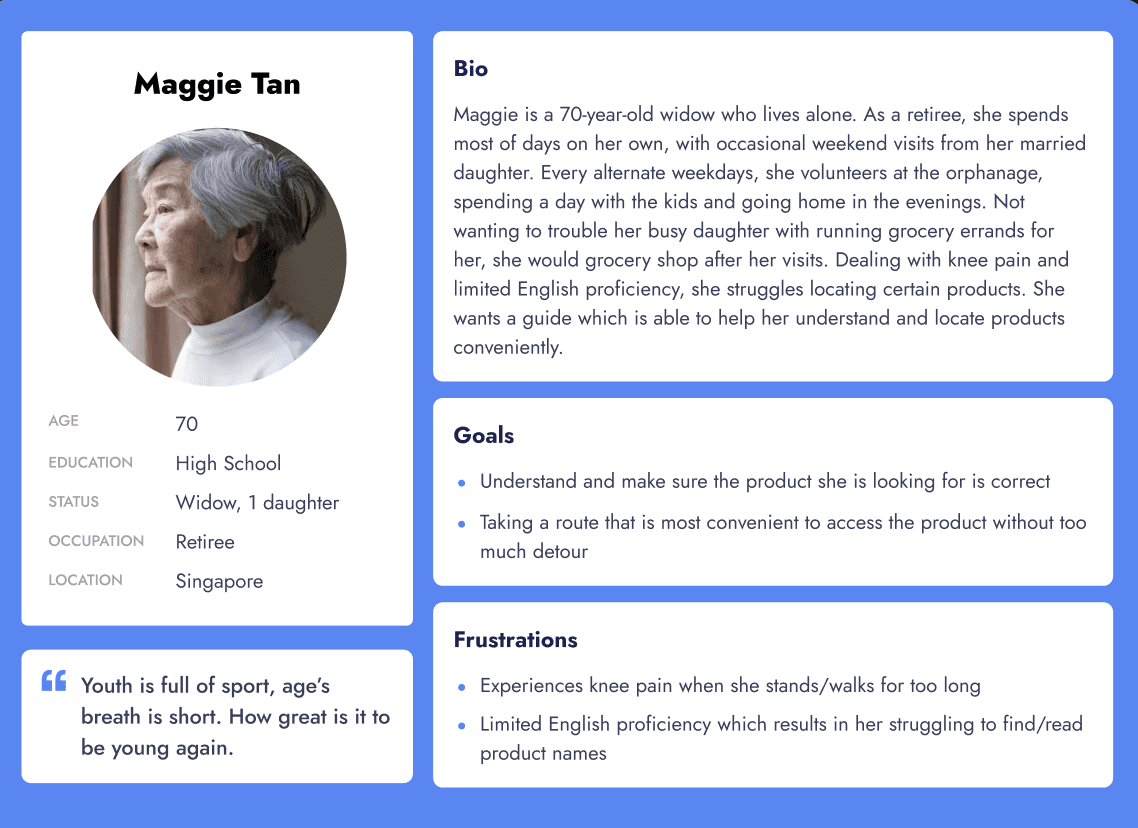
Problem Statement
Maggie is a retiree who needs a grocery map guide because she has trouble locating and identifying products in store with their constant change in locations.

Wireframes
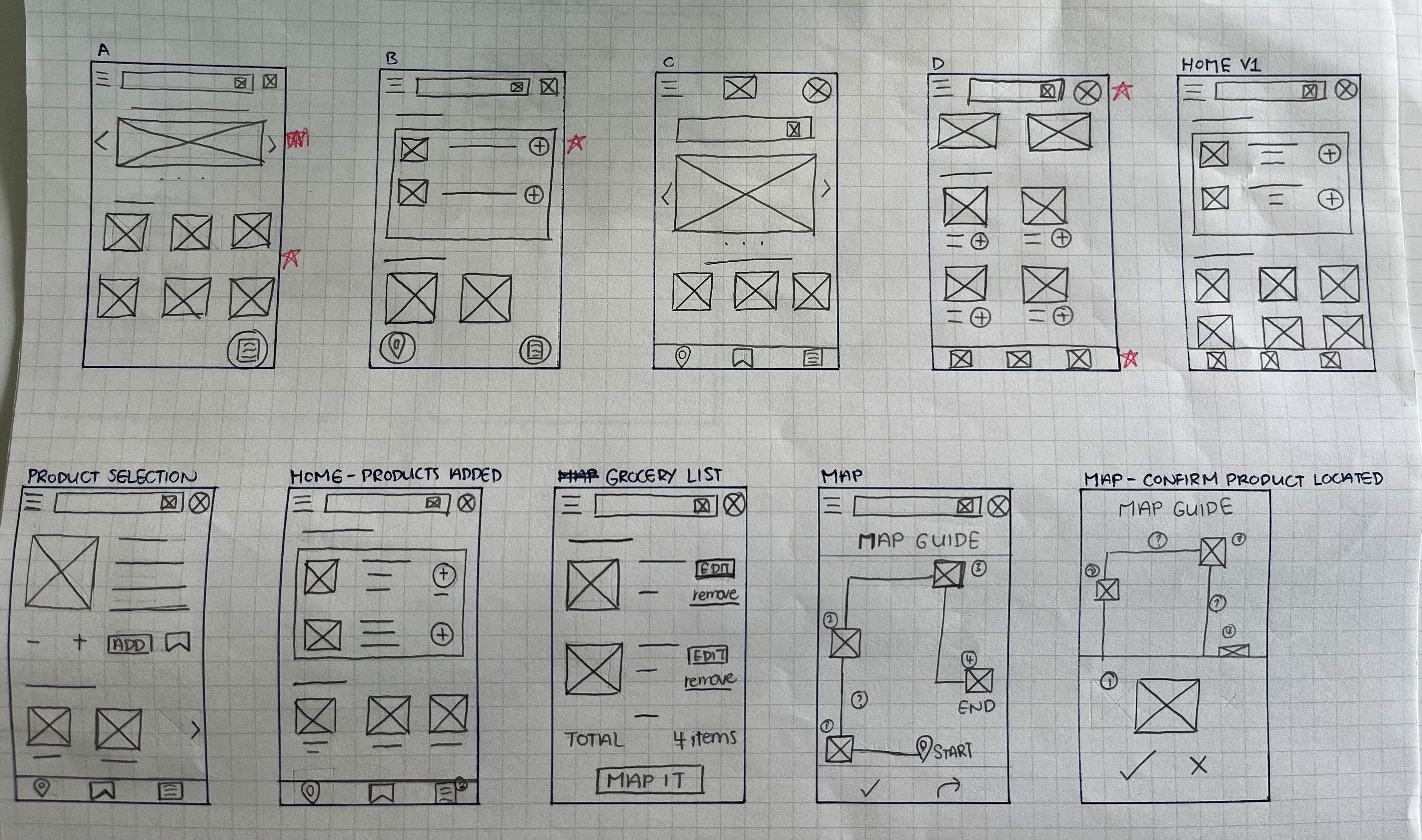
Paper
I sketched out numerous homepage wireframes for brainstorming, selected the parts I want included and combined them in the final homepage layout.

Digital
From paper to digital, I finalised one that best represents user flow and meet user needs. Call-to-action buttons are prioritised, followed by visual element placements.
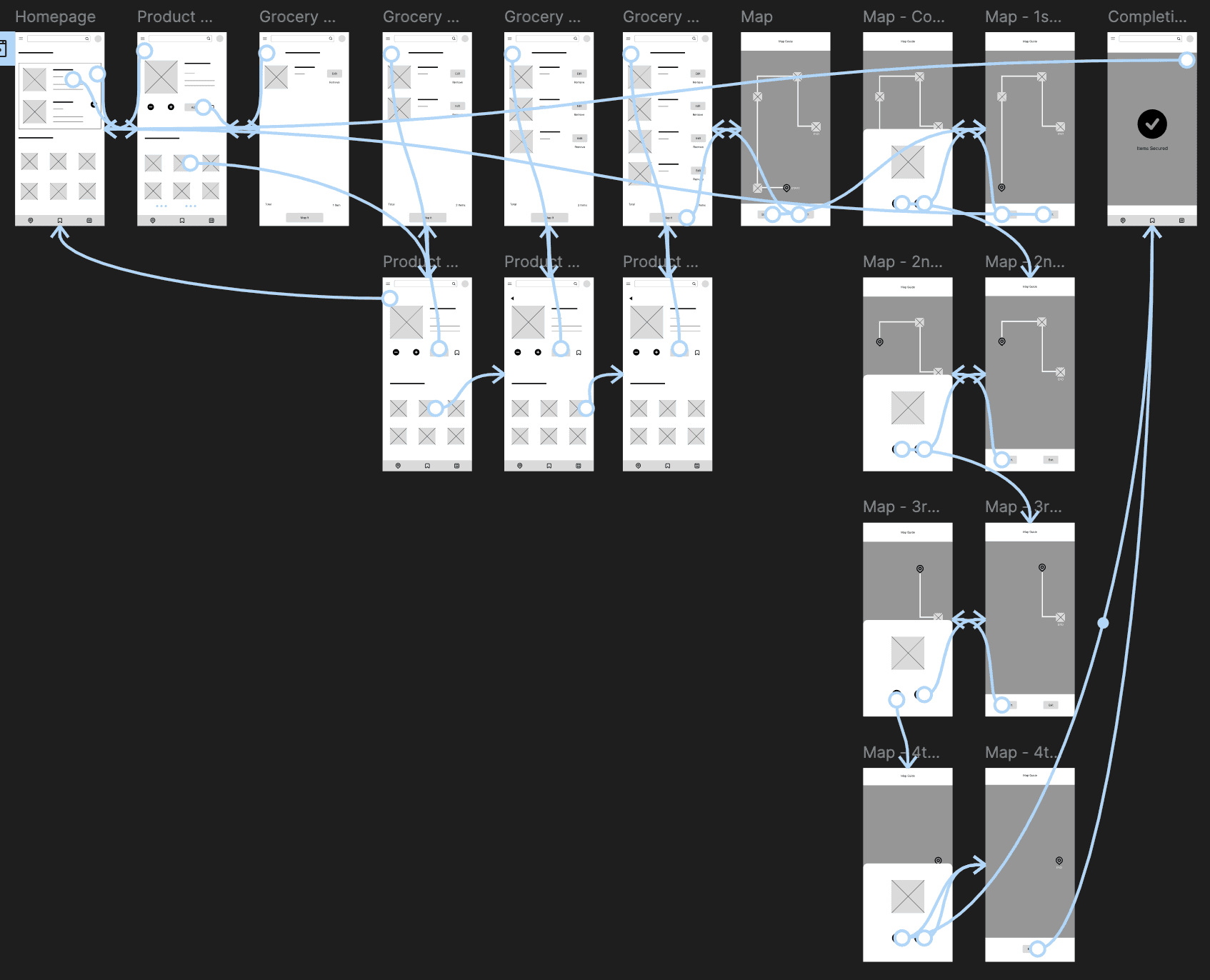
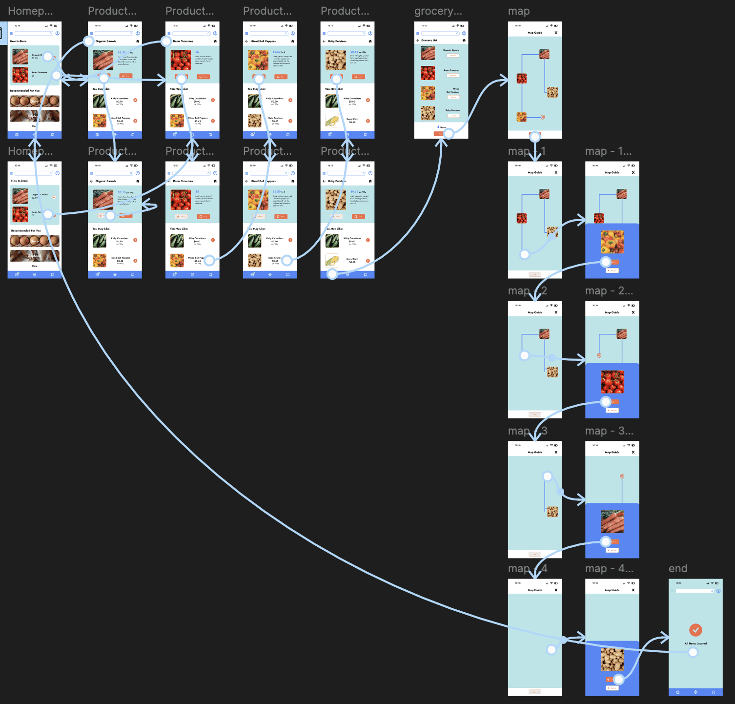
Low-Fidelity Prototype
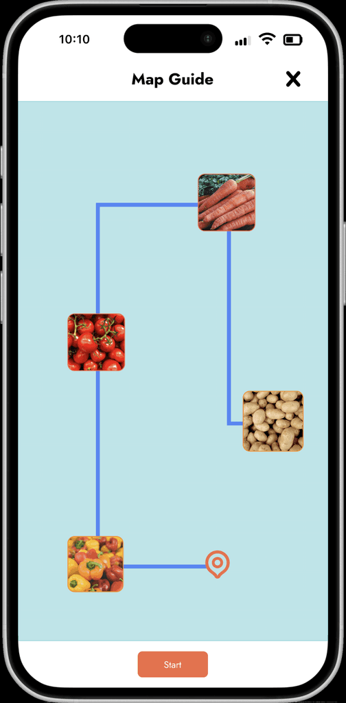
My primary user flow is to create a product map guide by: adding products to grocery list > collating and mapping products > following map to products.
Usability Study
Unmoderated Usability Study
4
Singapore
20-25 minutes
Too many products displayed in a screen, making it look messy and cluttered.
User flow is too long with some unnecessary interactions and unclear actions.
Mockups
Reduced Display of Products (on each screen):
Based on usability study's insights, I reduced the number of products shown on screens.
I have implemented white space to allow breathing space.

Before

After

Before

After

Before
After
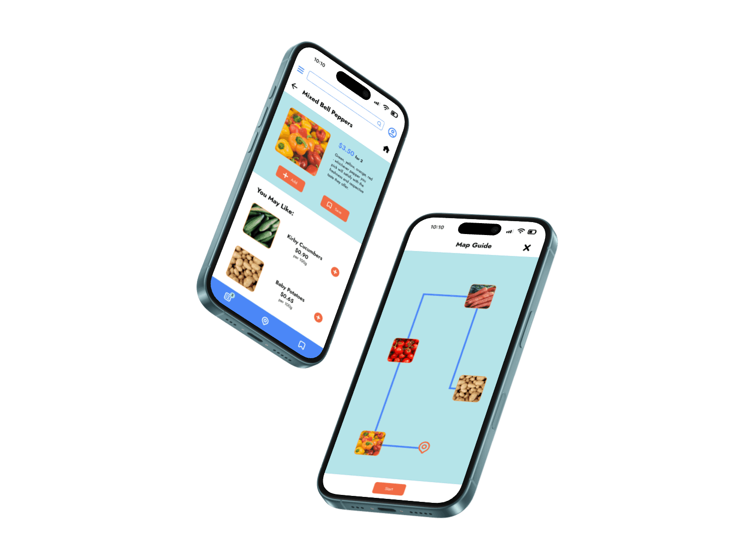
Hi-Fidelity Prototype
Following the same flow as my lo-fi prototype, I made design changes based on usability study feedbacks.
UX Prototype Demonstration
Accessibility Considerations
Project Takeaway
Target user finds that navigation and flow are straightforward and easy to access, with a clean layout.
The layout of different elements and information can vastly affect the overall look and feel of the website.